SUNDAY JOINT, 1-28-2024: STAB MAGAZINE WAS THE SHARPEST TOOL IN THE SURF-MEDIA SHED
rfHey All,
The print version of Stab magazine, which was published out of Australia from 2004 to something near 2014 (that’s where my collection stops, anyway) was a distant cousin of a short-lived early ’90s magazine called Beach Culture, in that the graphic design jangled and jarred and did everything but reach up and grab you by the throat.
Stab was also a bit like Playboy, softcore and lad mag-y and happy to venture from its primary subject (naked girls for Playboy; surfing for Stab), and also because the tone and voice for each magazine so clearly belonged to one person—Stab cofounder Derek Rielly, I think, would be happy to be called the Hugh Hefner of surfing, and if the rest of us think that’s icky and retrograde, Derek’s wolfish white-toothed smile will only grow; kiss-my-lavender-scented-ass provocation wasn’t job #1 for either man, but it was (still is, for Derek) Top Five for sure.


Stab borrowed a little from Surfer’s Journal and Game Boy-era Surfing World by splurging on 70-pound semigloss paper stock, lux-quality inks, square-binding, and as a rule taking the most expensive option in every aspect of the printing process.
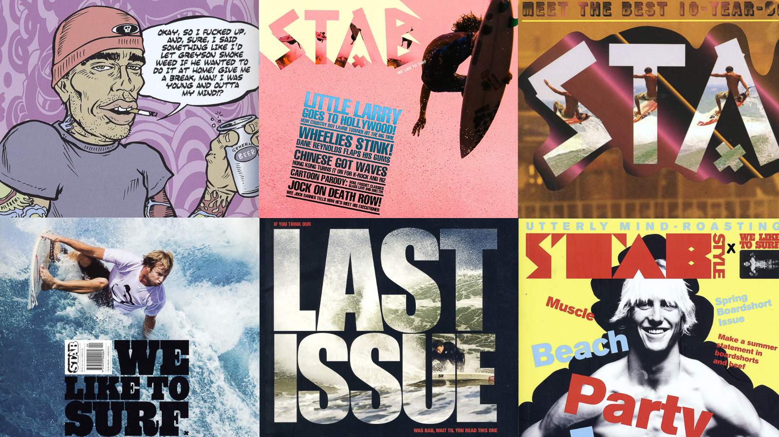
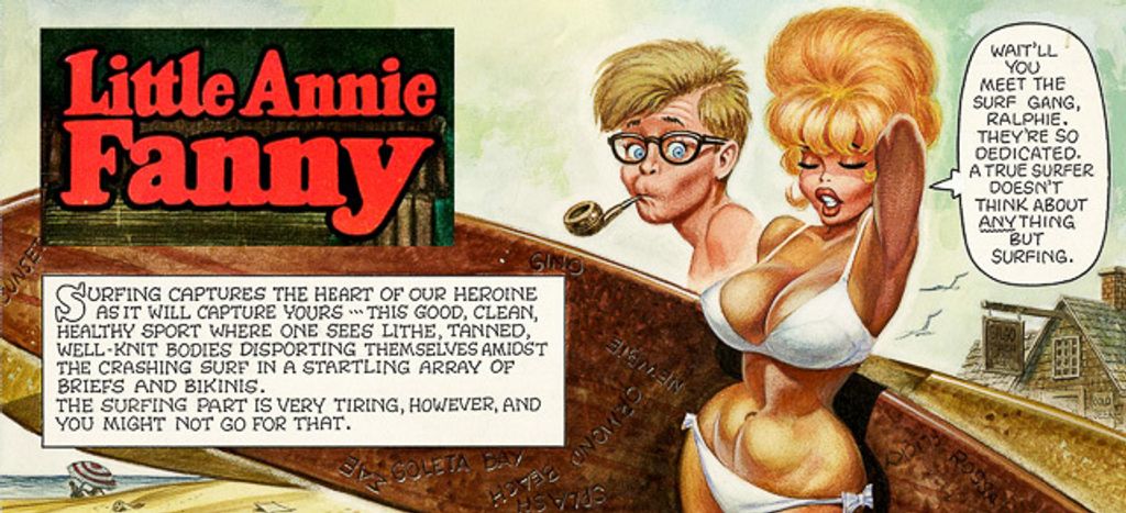
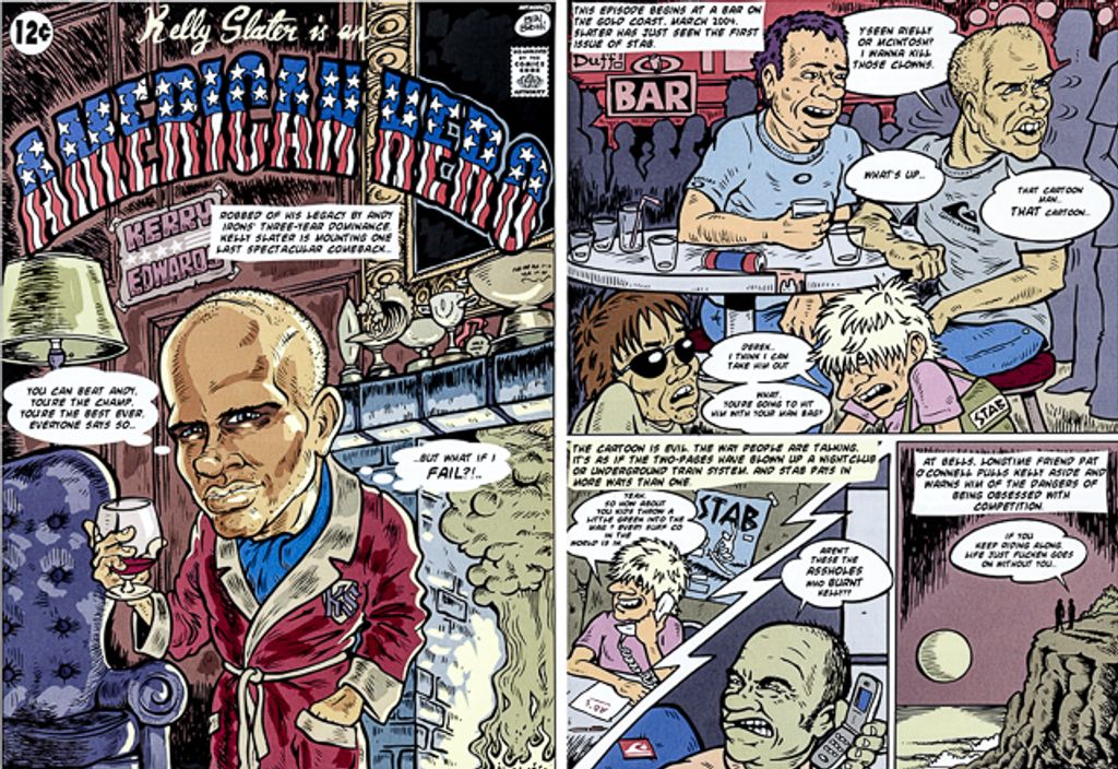
Finally, and Rielly brings this with him wherever he goes, Stab at times did a pretty decent imitation of Mad magazine—it’s there in the cover blurbs (“If you think our LAST ISSUE was bad, wait till you read this one!”), and especially in the fantastic and much-missed Stab Comics series, which pulls equally from Mad and Playboy’s “Little Annie Fanny” strip, and that makes sense because Annie was created by Mad founder Harvey Kurtzman.

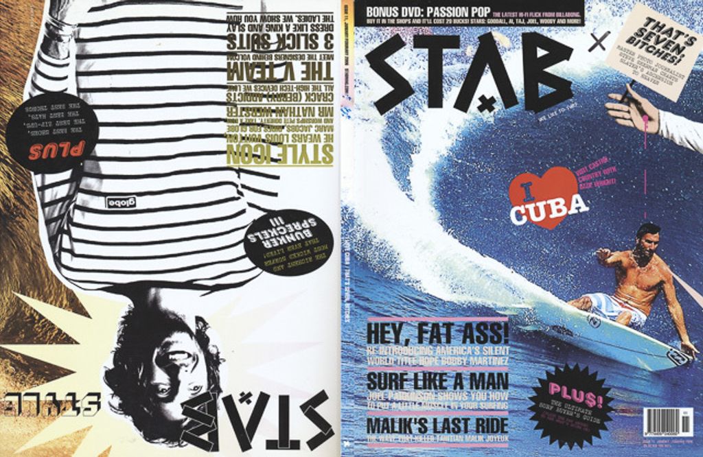
But for all that, my take on Stab has always been that, in print form, it was by and large without precedent, almost sui generis, an essential protein or two away from being a new surf-media lifeform. It was focused and manic at the same time. The pockets felt very, very deep (I’ll bet my two-thirds-paid-for house that Stab was page for page not just the most expensive surf magazine ever made but among the most expensive news-rack-available magazines of any kind), yet each issue looked and felt like something made, front to back, on a three-day speed binge. I don’t mean that as a slight. I read something once, it was either about Stax or Muscle Shoals or maybe the early Beatles records, that talked about how if a group of creative people are exceptionally talented and on the same page and on a mission, then amazing work can be accomplished with equally-amazing speed. Stab wasn’t the Beatles. Fred Pawle, Matt George, Lewis Samuels and a few other contributing writers put some ballast in there, but the magazine almost comes off as a throwaway. Which for me is part of the thrill. And that thrill, now that I think about it, is very surfy. Stab was both high-end and extravagant and disposable (the Surfer’s Journal version of high-end, by contrast, begs to be archived), except if you tossed it you would never fully understand and appreciate how much Rielly and team put into every page, no detail too small to not mess with, the hundreds of color choices, the wordy captions and sub-heads, the confetti-drop of fonts, bolds, italics, underscores. For two years straight, the Stab logo changed every issue. The magazine’s trim size wasn’t quite that flexible, but close—I count six sizes between 2004 and 2009, including a 2008 hardbound Special Millennium Issue (“We know, we know, eight years late. Them deadlines are killer!”) that measured 16.5" x 12" weighed over three pounds. Starting with issue #11, you got halfway through the magazine and had to flip it over and upside down, and there’s a second cover and sort of but not really a second magazine, Stab Style, which I’m 98% sure was a grab for more surfwear ad contracts but never mind, the fun continued. Stab was extra, 15 years before that word came into (and fell out of) fashion.
It was too good or maybe too strange to last, but it lasted way longer than it probably should have. Rielly and cofounder Sam McIntosh had a major and never-mended falling out; in 2014, Derek went on to cofound BeachGrit, which has all of the humor of Stab but none of the flash or fine detail; McIntosh wisely and deftly steered Stab out of print into the handsome but mainstream finger-on-pulse website you see here.
I don’t miss Stab, exactly. It was very much a creation of, and a force behind, the period in which it lived. Like a lot of great things—Led Zeppelin, Happy Days, Elgin Baylor—the print version of Stab hung on a little too long, or at least didn’t quite go out on its own fizzy terms. I do find myself wishing that something else would come along, another bolt from the surf-media blue. Not a replacement for Stab, but something with Stab-like ambition and layers and confidence and verve. But I suspect the sport has outgrown or evolved or devolved to a point where a project like that could take root and flourish. I hope I’m wrong.
Stab is not the “Last Surf Magazine,” as my original and overwrought title for today’s Joint stated before I erased and started over. It is not even the last surf magazine I’ve enjoyed or learned from or otherwise valued. But Stab is the last surf magazine I devoured.
Thanks for reading, and see you next week!
Matt
[Image grid, clockwise from top left: Detail from Stab Comics’ 2006 “Confessions of an Opium Eater;” Stab cover, 2006; Stab cover, 2005; Owen Wright flexing on Stab cover, 2009; Stab “Last Issue” cover, 2009; Taj Burrow on Stab cover, 2008. Hugh Hefner, around 1964. Derek Rielly, 2015. “The Surfers,” Little Annie Fanny strip in Playboy, 1965. Mad magazine founder Harvey Kurtzman. “Kelly Slater is an American Hero,” from 2005 issue of Stab. Joel Parkinson and Nathan Webster on 2005 Stab cover.]